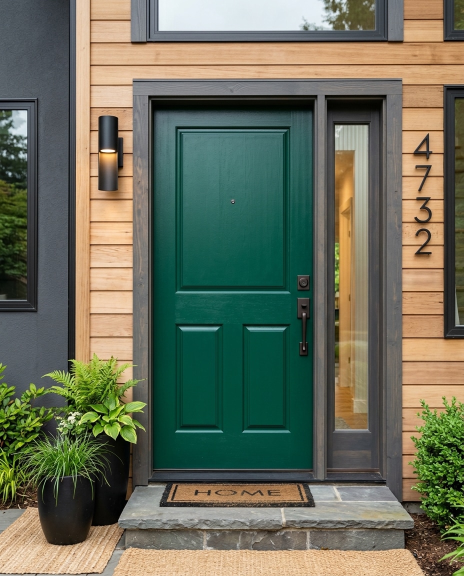
A front door is the simplest (and most affordable) dramatic change you can make to a house.
Two coats of paint, a free afternoon, and the same building reads differently to everyone who drives past it. Historic. Modern. Coastal. Formal. Cared for.
Or even forgettable. Because the wrong front door color doesn’t make a house ugly — it makes it invisible.
What follows is fifty colors ranked from the most polarizing (#50) to the most universally loved (#1). Where a specific shade is genuinely iconic, we’ve named it.
50. Mustard Yellow
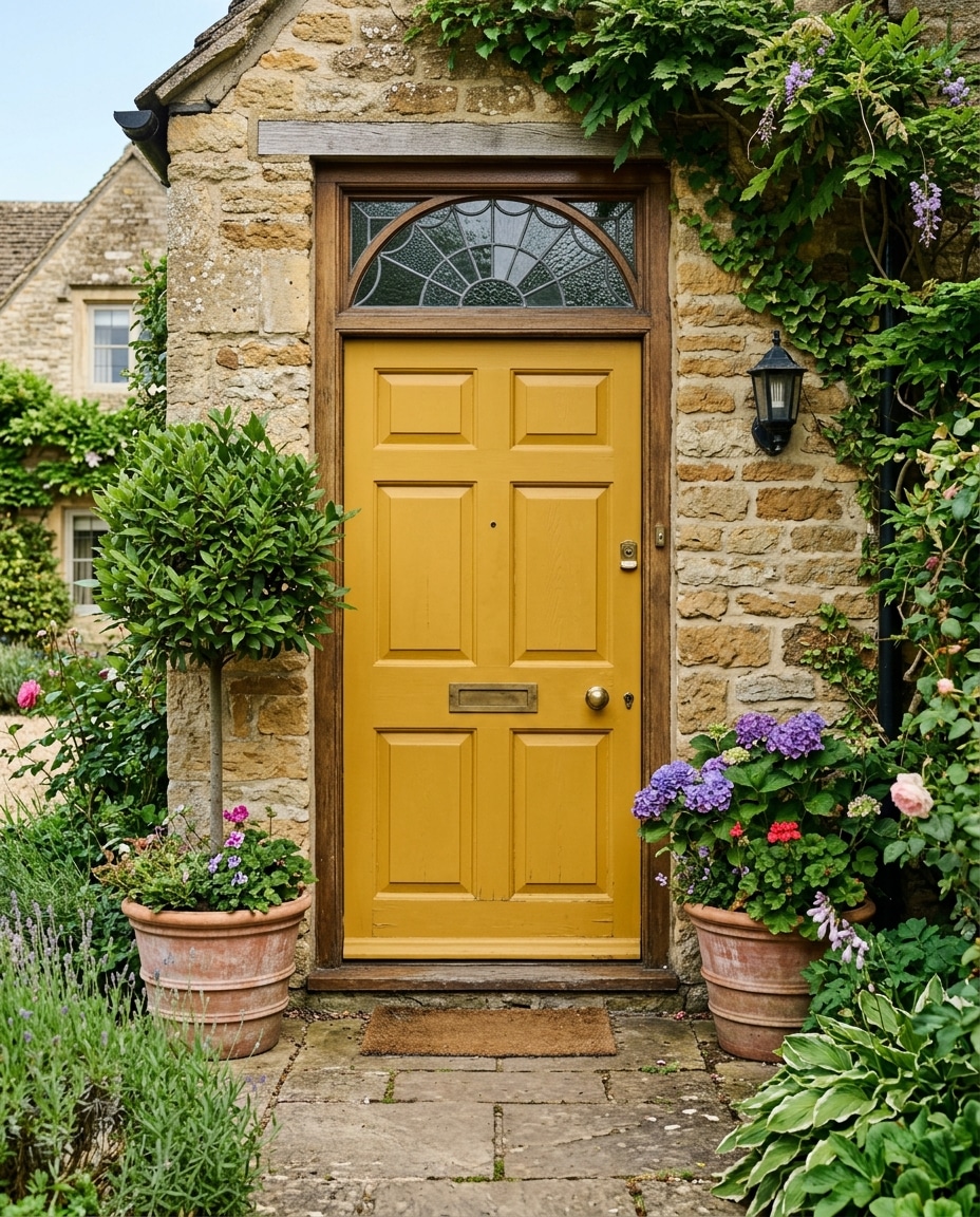
Few colors divide neighbors faster.
On a mid-century ranch with charcoal cladding, mustard yellow photographs like a magazine cover. On a vinyl-sided colonial in a beige cul-de-sac, it photographs like a dare.
Restraint is everything. One yellow accent — the door, period. No yellow planters. No yellow welcome mat.
49. Cobalt Blue
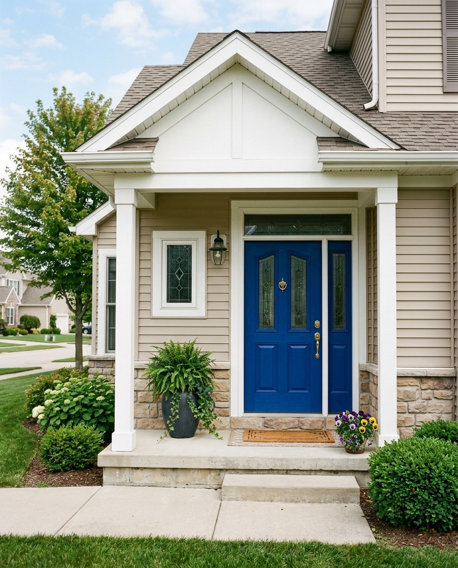
Designers reach for cobalt when a house needs personality but its bones are otherwise modest.
A flat suburban front becomes interesting the moment the door is cobalt. But only if the rest of the exterior steps aside and lets it talk.
Crisp white siding, restrained landscaping, no other strong color anywhere in the frame.
48. Aqua
Aqua belongs to a specific geography: anywhere within smelling distance of saltwater.
On a Florida cottage or a Cape Cod bungalow it reads as breezy and intentional. Two states inland, it starts to look like a motel.
Avoid stacking it with anchor decor and painted Adirondacks. The more nautical signifiers you add, the more theme-park the porch becomes.
47. Mint Green
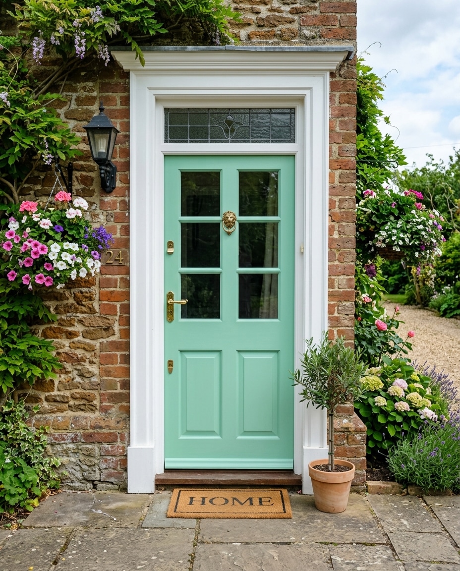
Mint is having a quiet renaissance in older neighborhoods.
The distinction between “vintage” and “dated” is whether the rest of the house respects its bones. On a 1920s bungalow with original woodwork: charming. On a 2008 spec build with composite trim: not.
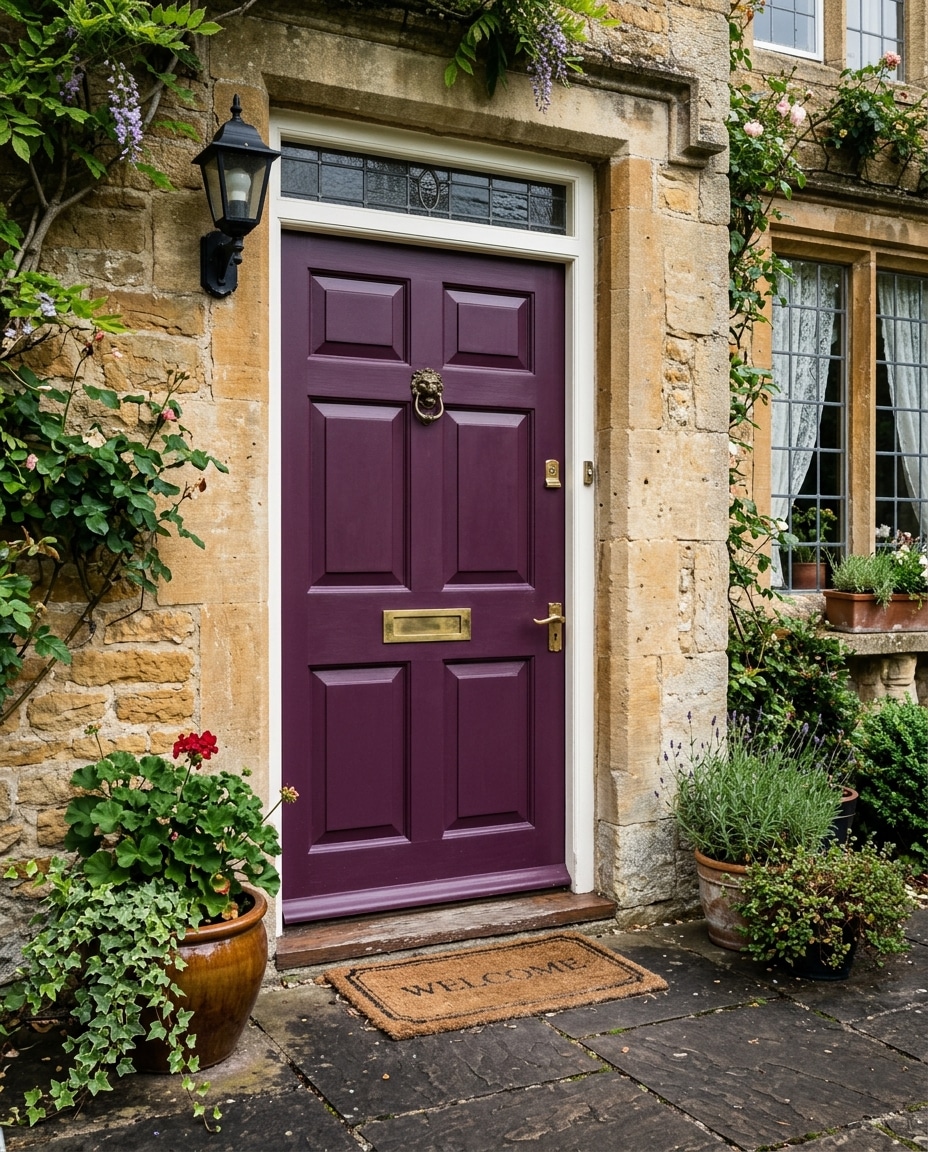
46. Eggplant Purple
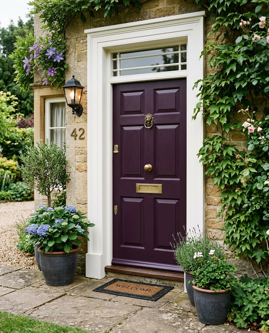
Eggplant is purple for adults.
Deep enough to read as moody rather than playful. Rich enough to suggest opinions about wine and probably a velvet couch indoors.
Hardware decides whether it lands. Brass or aged gold: yes. Polished chrome: avoid.
45. Periwinkle
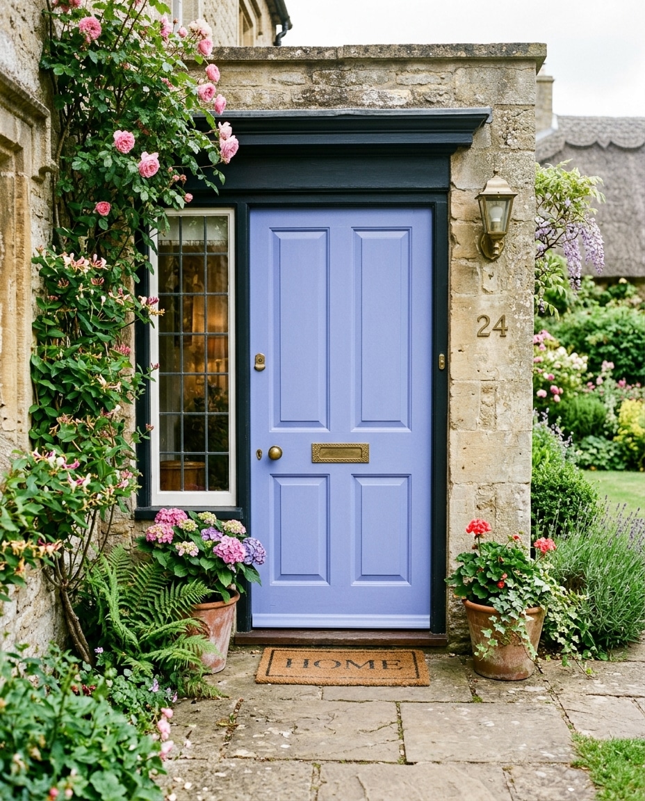
The color of an old country inn that everyone on the road remembers.
Soft enough to feel approachable, blue enough not to read as pink, slightly storybook in the best way. Best on cottages with deep porches and flower beds that earn their keep.
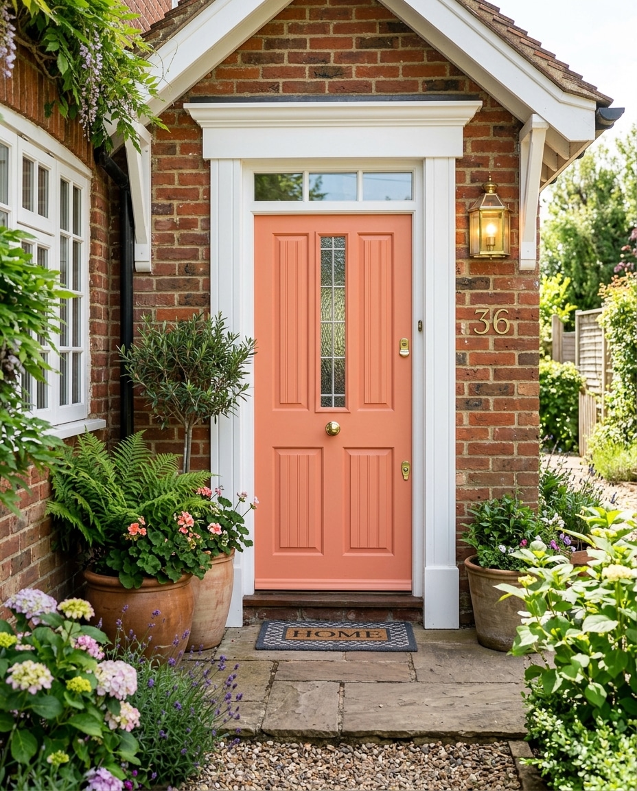
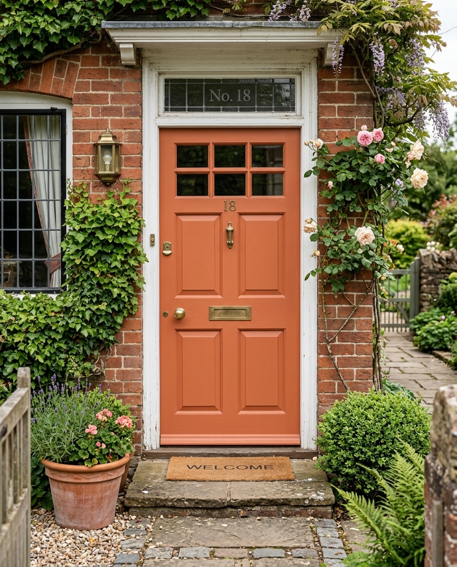
44. Coral
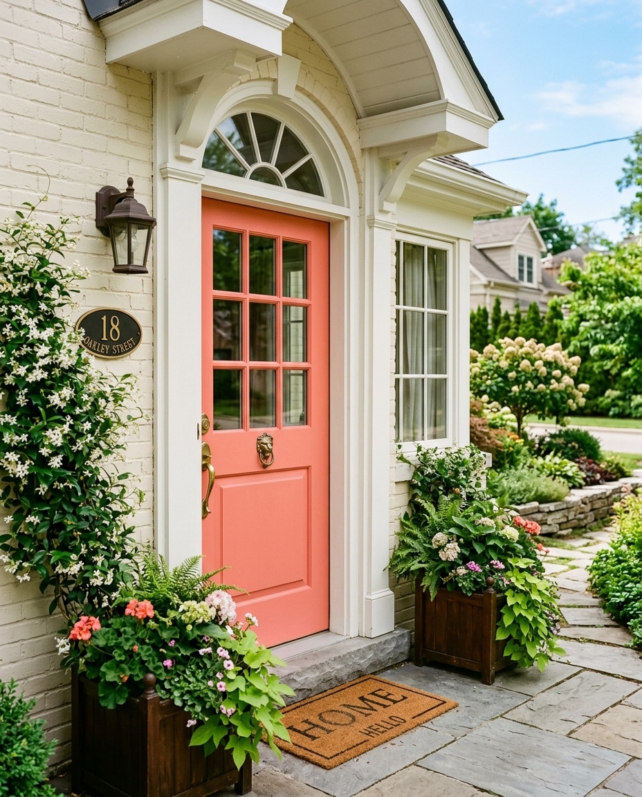
Coral is the color equivalent of a person who’s genuinely happy to see you.
Warm, energetic, almost impossible to be in a bad mood around. On a white stucco home or coastal cottage, it sings.
Matte finishes only. Glossy coral edges into kids’-bedroom territory faster than expected.
43. Turquoise
Turquoise is for homeowners who’d rather be remembered than admired.
It almost always becomes the visual centerpiece of the exterior, whether you wanted it to or not.
Simple architecture handles this best. White stucco, adobe, desert landscaping with agave: ideal context.
42. Soft Blush Pink
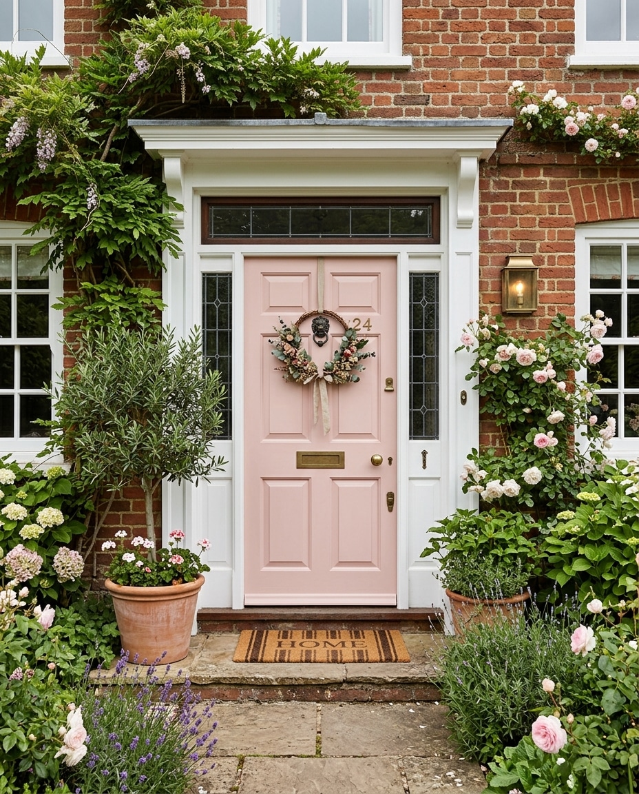
The trick is making it read sophisticated, not sweet.
Dusty, slightly muddy pinks (think Farrow & Ball’s Setting Plaster) get the assignment. Bubblegum pinks don’t.
Black hardware grounds it. Burgundy or peach blooms in the flower bed pull the whole entrance together.
41. Lavender Gray
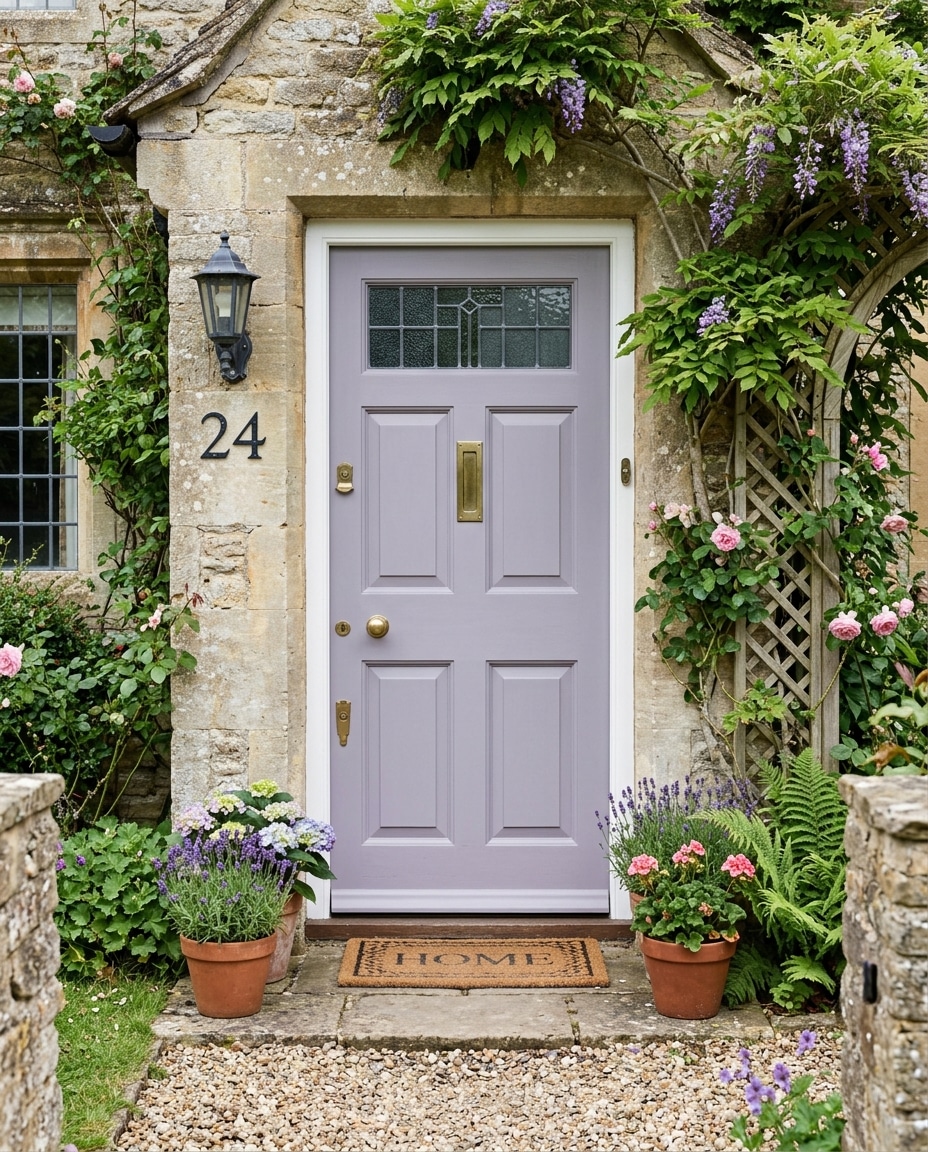
Looks weird on a chip. Lovely on a house.
The lavender reads as gray most of the day and only reveals itself in flat morning light. That’s part of the charm.
Especially good against climbing roses or wisteria.
40. Burnt Orange
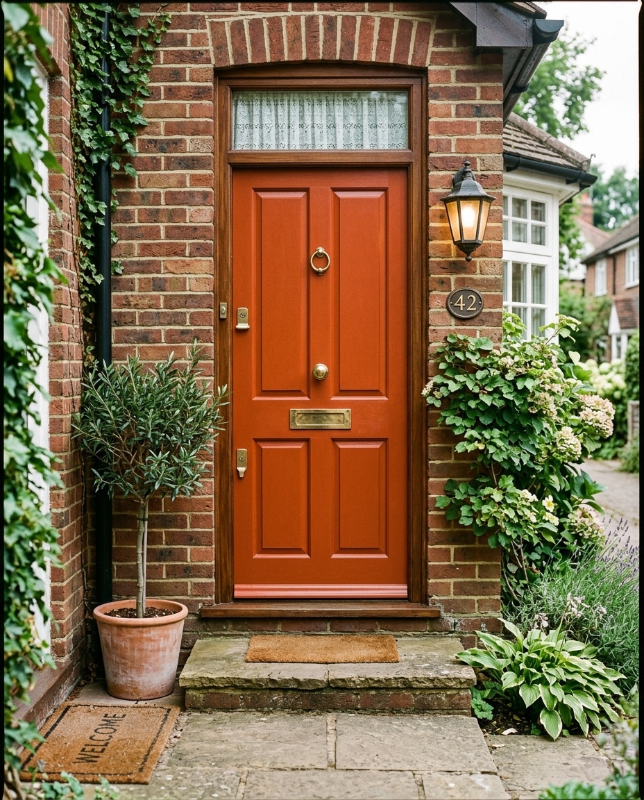
Burnt orange is what you reach for when you want warmth without resorting to red.
Unmistakably Southwestern. Sun-worn, earthy, slightly artistic. Pairs effortlessly with terracotta planters and matte black sconces.
It glows in autumn light and goes slightly muddy under flat winter overcast. Audition a sample if your region has nine months of gray skies.
On the deep jewel tones — plum, eggplant, burgundy, emerald: these colors live or die by the finish.
Flat and matte read as expensive and intentional. High-gloss can swing toward Halloween. When in doubt, drop the sheen.
39. Plum
Most people don’t consider plum until they see it done well, at which point it becomes hard to forget.
Victorian and Edwardian homes wear it especially beautifully. The more architectural detail the trim has, the more the plum has to play against.
38. Copper
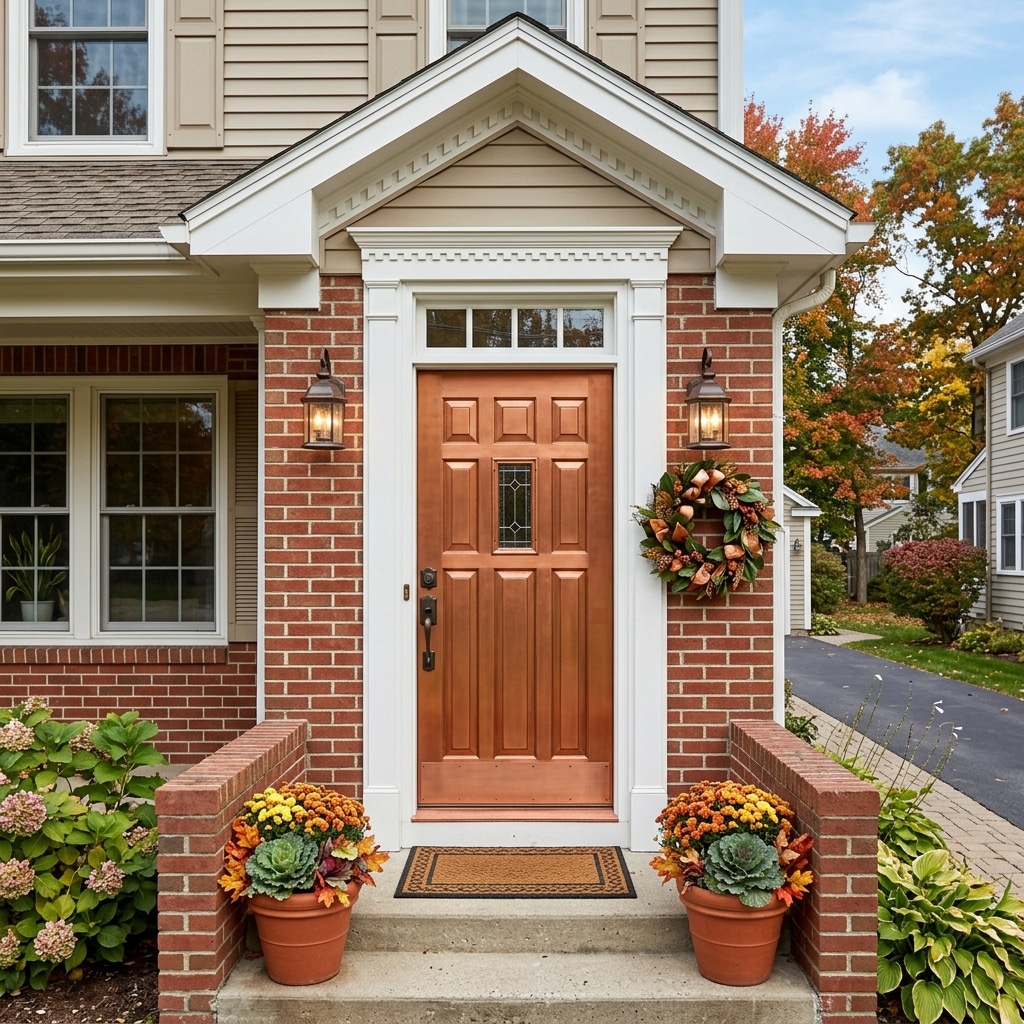
Copper paint is a different animal because it’s metallic.
Morning shade reads brown. Late afternoon sun almost glows. Porch sconces at night can make it luminous.
Best on contemporary homes with black window frames. Anything fussy underneath competes with the effect.
37. Ice Blue
The front door equivalent of a deep breath.
Crisp, clean, slightly Scandinavian. Best on white modern homes or beach houses where the cool undertones reinforce the airy feel.
Brushed nickel pairs naturally. Brass fights it.
36. Soft Yellow
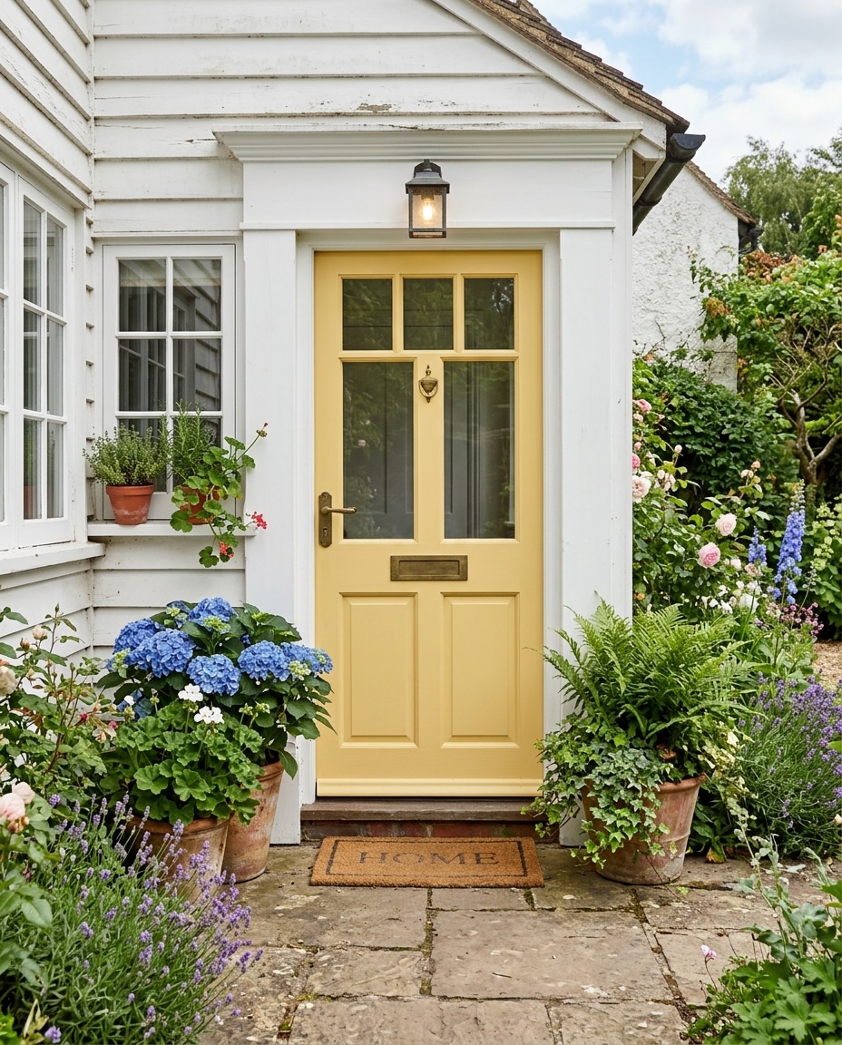
The buttery kind, not the lemon kind.
One of the most underrated front door colors in suburban America — cheerful without being loud, optimistic without being childish.
If a chip looks even slightly highlighter-adjacent, keep moving.
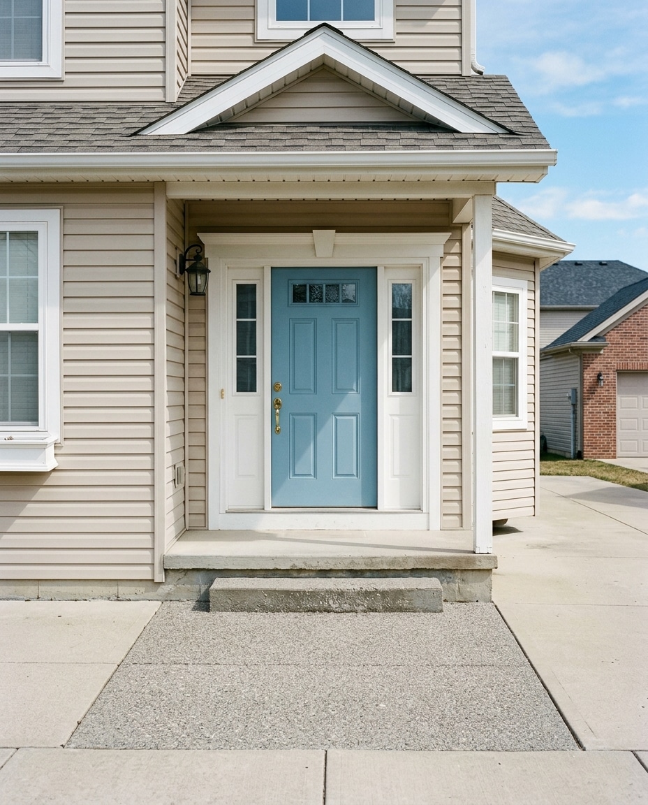
35. Soft Sky Blue
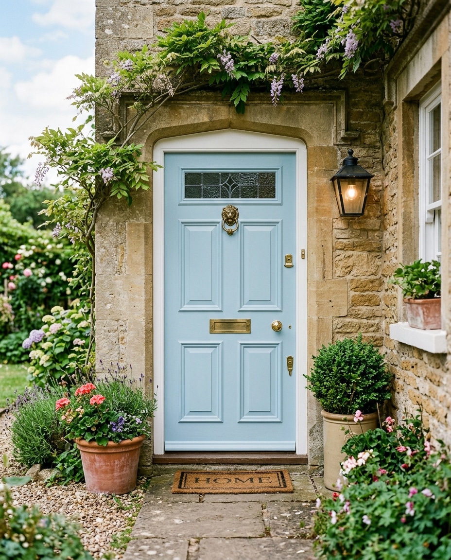
Sky blue does something specific: it makes a porch feel cooler in temperature.
Not literally — visually. The eye reads it as breeze and open air.
On a beach cottage with a wraparound porch, it’s almost unfair how good this looks. Pairs with hydrangeas, wicker, and natural cedar.
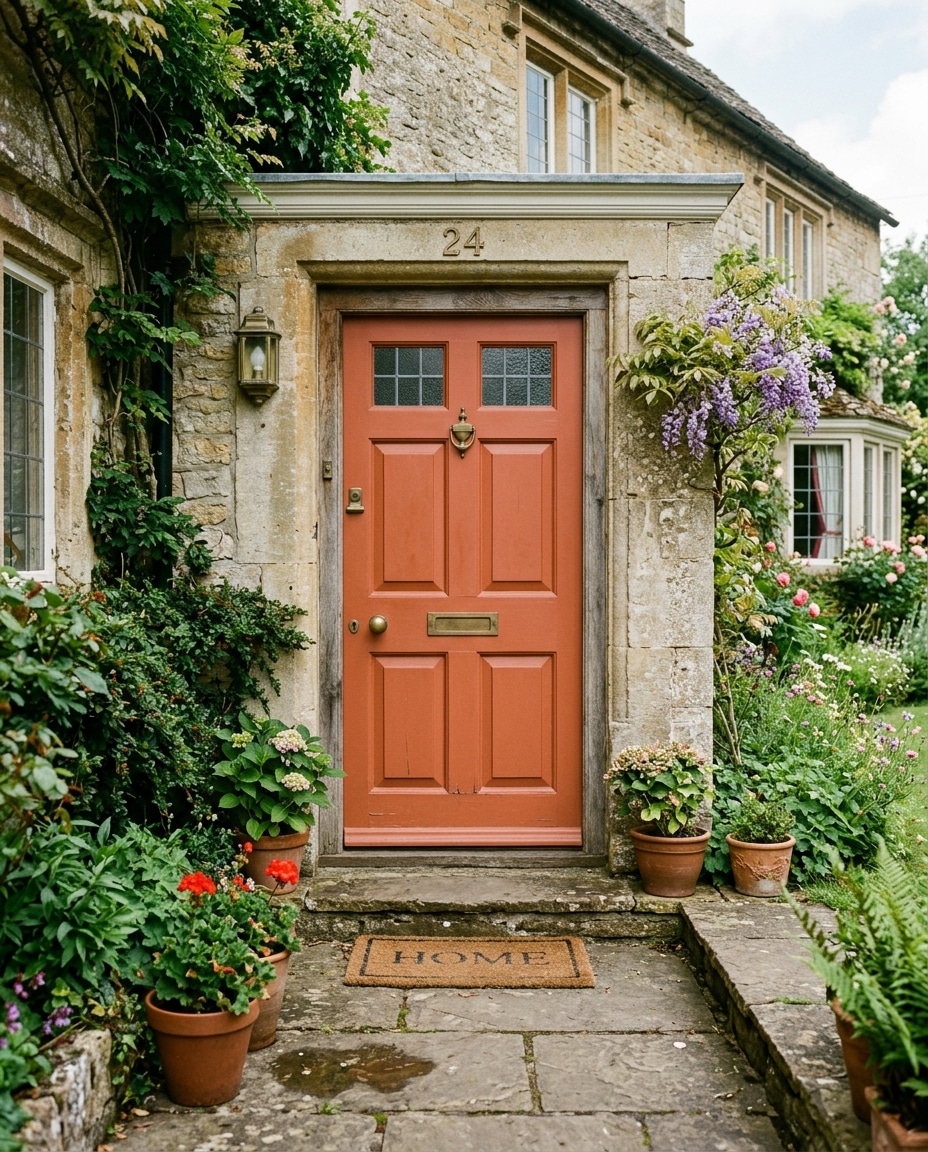
34. Coral Peach
Coral, dialed down two notches.
Where coral demands attention, coral peach invites it. Easier to live with long-term, especially on white cottages surrounded by lush landscaping.
Matte finish, again. Glossy versions read costume-y fast.
33. Seafoam Green
Nostalgic in a way that’s hard to fake.
Feels like an old coastal town that hasn’t been gentrified yet — slightly faded, salt-aged, never trying too hard.
Best in spring and summer light. Under flat winter skies it can go slightly hospital-blue.
32. Moss Green
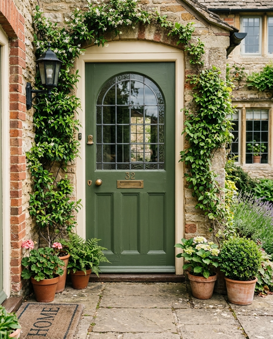
Moss tucks a house into its surroundings instead of making it pop against them.
On a cabin in mature trees, this is exactly what you want. The house feels like it grew there.
Reads dull against bright white siding. Warm cream or natural cedar is a much better backdrop.
31. Olive Green
Where Mediterranean meets military.
Earthy, grounded, slightly European. On stucco homes with warm stone and terracotta accents, it’s genuinely transportive.
What olive cannot do: coexist with cool gray siding. The undertones fight. Warm exterior palettes only.
30. Royal Blue
The energy of cobalt with better manners.
Still draws the eye, but sits more comfortably alongside traditional architecture — white brick colonials, suburban two-stories, anything with formal symmetry.
Royal blue is a soloist, not a section player. Keep everything else quiet.
29. Sand
The architectural equivalent of a beige sweater.
Warmer than it sounds, more versatile than a chip suggests, easier to live with than nearly anything else on this list.
Black fixtures rescue sand from looking washed out. Brushed nickel makes it look beige.
A quiet defense of neutrals.
The design world keeps trying to convince homeowners that neutrals are boring. The resale data doesn’t agree.
Homes with soft beiges, warm grays, and classic creams photograph better in MLS listings and appeal to wider buyer pools. “Boring” is not the worst outcome.
28. Beige
The right beige (warm, slightly creamy, never pink-tinged) makes a house feel calm and considered.
Stone homes and traditional suburban houses with warm landscape palettes wear it especially well.
Don’t underestimate it. Plenty of “wow” front doors are quietly just very good beige.
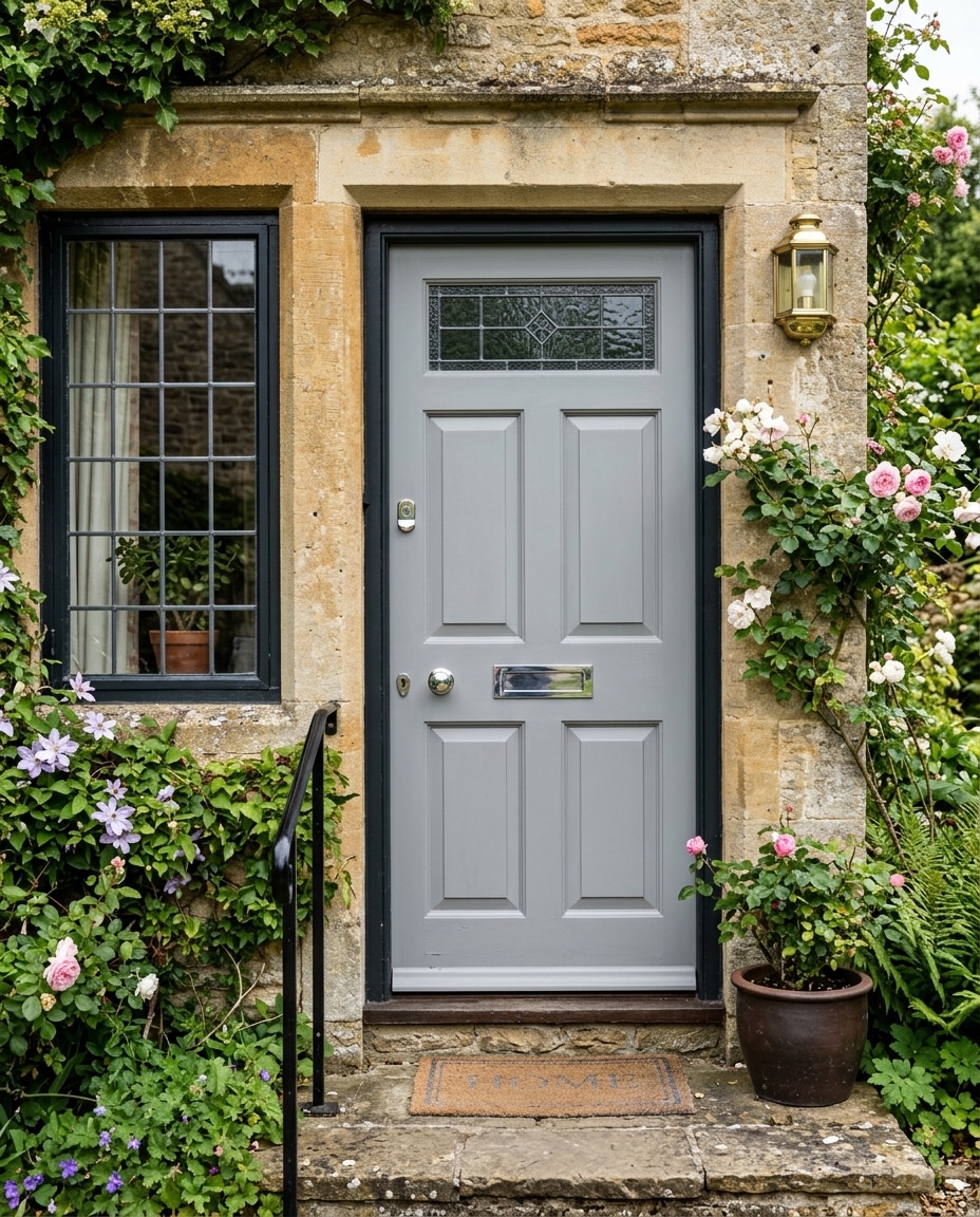
27. Pale Gray
What designers reach for when they want the door to disappear into a sophisticated whole.
Best on Scandinavian-inspired exteriors and minimalist black-and-white facades.
Pale grays shift hard with light. A paint that reads warm taupe at 9am can read cool blue-gray at 3pm. Always sample on the actual door.
26. Dusty Blue
What happens when a clear blue spends a couple of decades in the sun.
Faded, lived-in, comfortably old-fashioned. Perfect on farmhouse exteriors and any home where the goal is “been there a while.”
Aged brass and weathered cedar pair effortlessly. New shiny anything fights the patina.
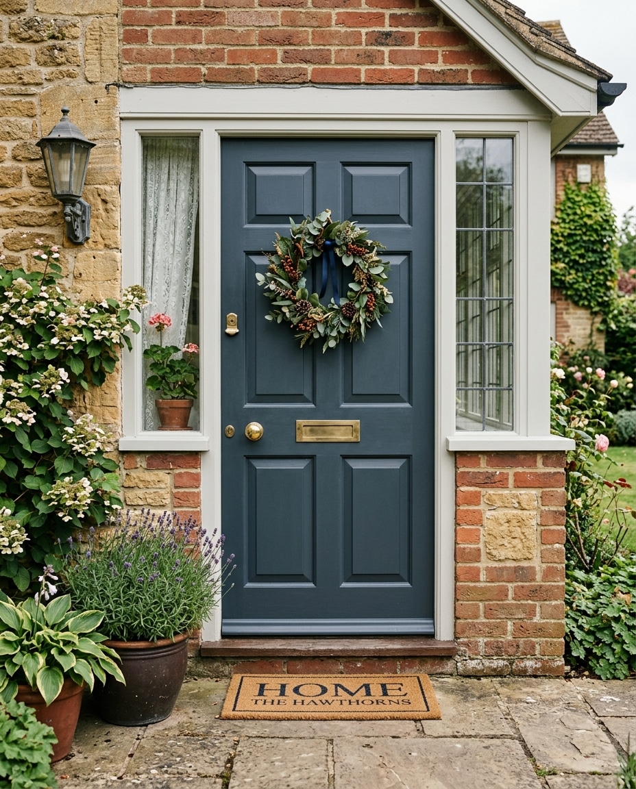
25. Slate Blue
For people who want navy’s polish without navy’s popularity.
Moody, mid-toned, and reads as more designed than the bluer blues. The kind of color that telegraphs the homeowner thought about it for longer than fifteen minutes.
Sherwin Williams Cyberspace and Farrow & Ball Down Pipe live here.
24. Teal
The bold-but-sensible compromise.
Bolder than navy. More grounded than turquoise. Less risky than emerald.
Frequently becomes the centerpiece of an exterior. Simple architecture handles teal best — competing trim muddies it fast.
23. Clay
Gold-hour magnets.
Soft, slightly pinkish, terracotta-adjacent earthy reds. Almost ordinary in flat morning light. Absolutely glow in late afternoon sun.
If you live somewhere with strong evening light, this is the color that rewards you for it.
22. Terracotta
Clay, but louder.
Still sun-soaked and Mediterranean, but it asserts itself rather than blending in. Even plain stucco homes start to feel transported.
Pair with clay pots, warm stone, and wrought iron lighting. Warm porch lights at night make it glow.
21. Silver Gray
The color you choose when you want polish without commitment.
Sleek, contemporary, quietly versatile across seasons. Equally at home against autumn foliage and winter snow.
Best on contemporary exteriors. On traditional homes it can read slightly cold — try warm greige instead.
20. Crisp White
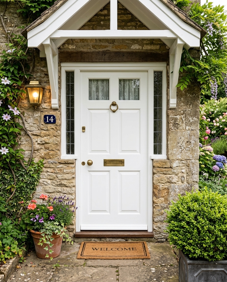
Anything but boring, done correctly.
The cleanest version of contrast — especially against dark siding, painted brick, or charcoal cladding.
Two practical notes. Satin finish, not gloss (gloss shows dirt immediately). And almost no white is actually white. Most have an undertone that only reveals itself once it’s on a six-foot door.
19. Cream
White that grew up.
Softer, warmer, far more forgiving on homes that aren’t trying to feel ultra-modern. Against natural stone and warm wood, it’s nearly perfect.
Black hardware against cream is one of the most reliably beautiful pairings in residential design. Almost a cheat code.
18. Greige
The gray-beige neutral that took over interior design around 2018 and never quite left.
That’s the strength and the weakness. It’s the safe choice, the resale choice, the choice nobody objects to and nobody specifically remembers.
If you’re selling within five years, greige is smart. If this is your forever home, ask whether you want a door optimized for the next owner.
17. Sage Green
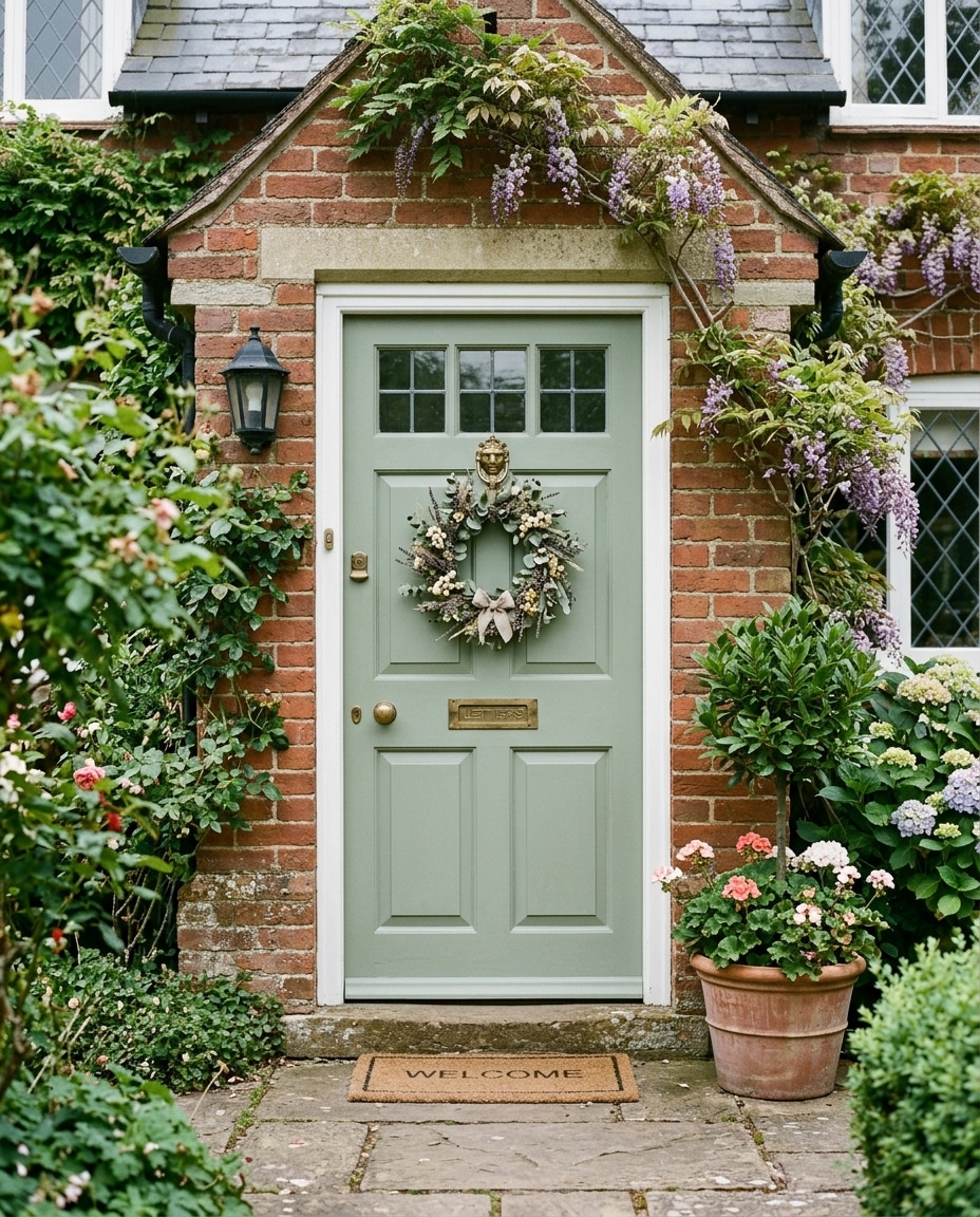
The soft, gray-leaning green that took over Pinterest for good reason.
Calming, slightly bucolic, photographs beautifully against almost any landscaping — ivy, hydrangeas, boxwoods, lavender.
It pulls dramatically in different lights. A sage that reads sophisticated under tree cover can read institutional in harsh midday sun. Porch orientation matters more than people realize.
16. Chocolate Brown
Does something most colors can’t: disappears into wooded surroundings while still feeling deliberate.
On cabins and rustic homes with heavy tree cover, it grounds the entrance instead of competing with the trees.
Stacked stone, cedar, and oil-rubbed bronze are the pairing. Cool grays and bright whites fight it.
15. Brick Red
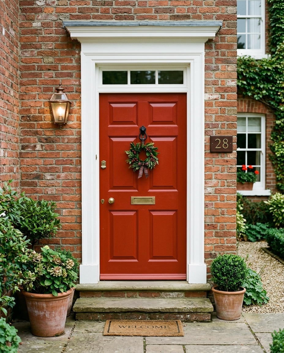
Softer, dustier, considerably more grounded than primary reds.
Warm, timeless, dependable on farmhouse exteriors and brick ranches especially.
Ages exceptionally well. There’s a reason this color has been a front door staple for two centuries.
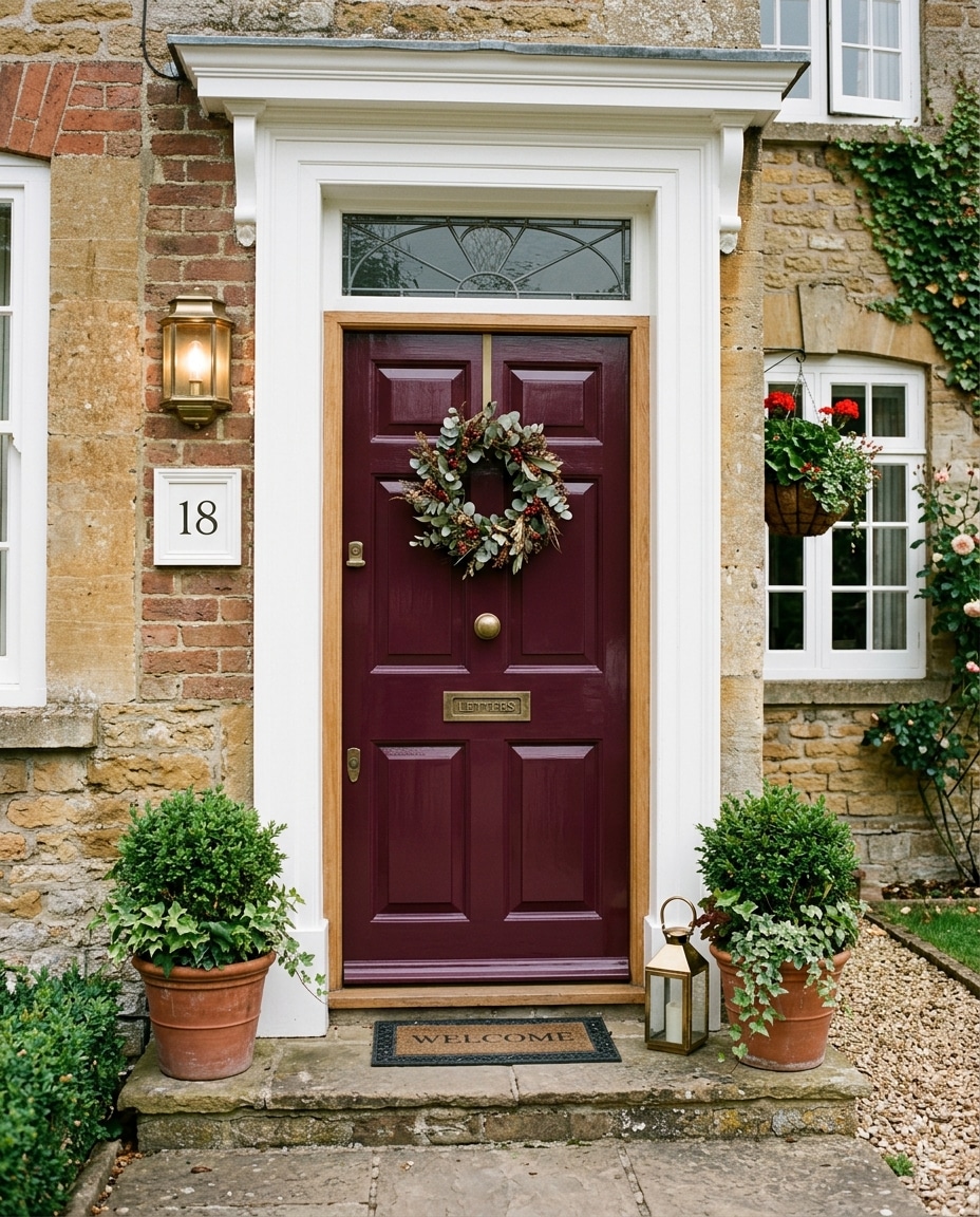
14. Wine Red
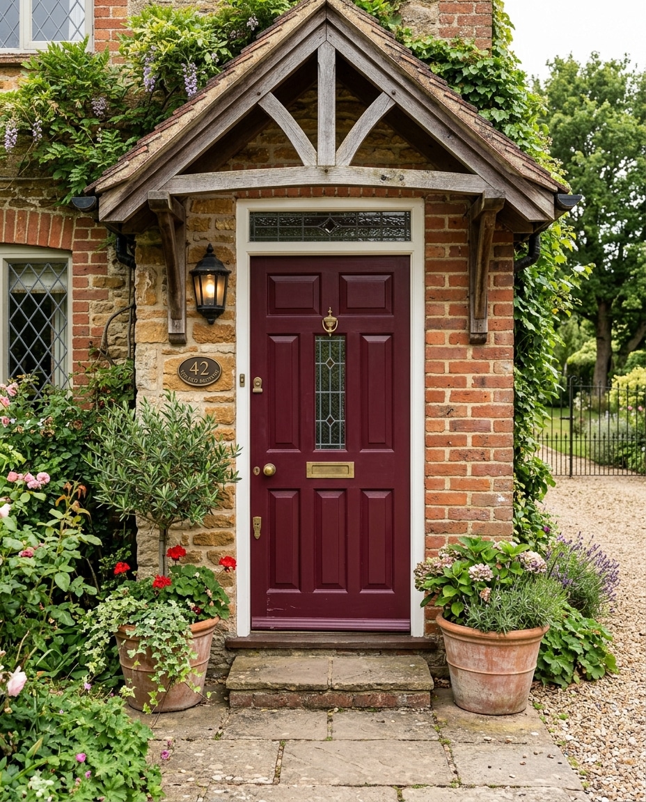
Brick red’s more luxurious sibling.
Deeper, richer, slightly purple-leaning. In evening light against cream or aged brick, genuinely beautiful in a way that’s hard to photograph and harder to forget.
Gold or aged brass hardware. Warm porch lanterns. Cool fixtures kill it.
13. Bright Red
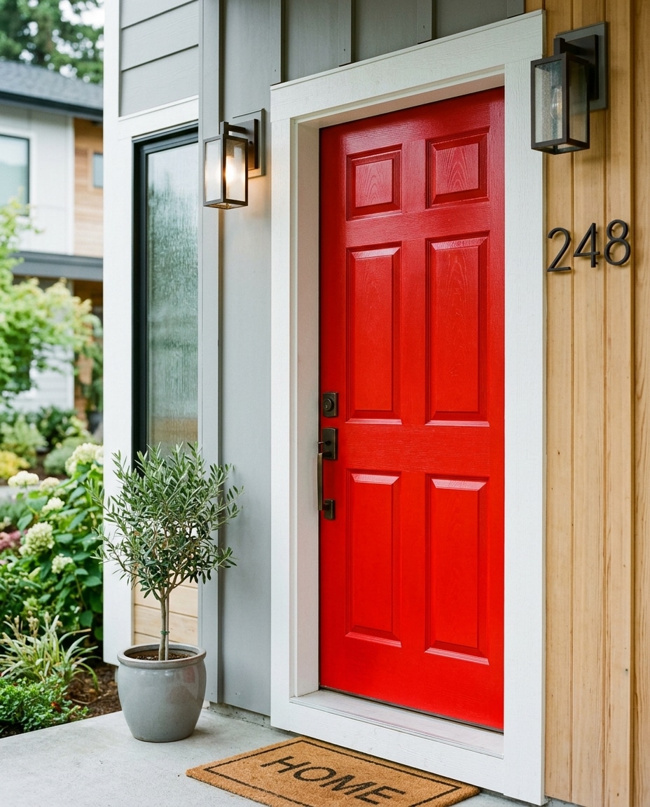
American front door history in a single can.
Colonial homes, white clapboard farmhouses, brick suburban two-stories — this is the color that defined “welcoming front door” for most of the twentieth century.
Benjamin Moore’s Caliente is the modern standard. Avoid ultra-glossy finishes — they tip into “fire engine” fast.
12. Hunter Green
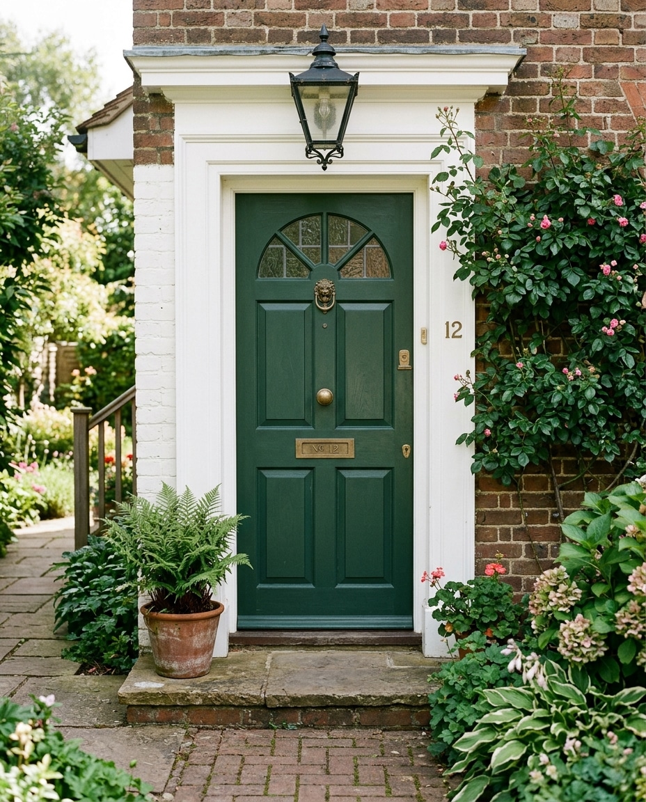
The official color of old East Coast money.
Traditional without being stiff. Formal without being cold. Almost impossible to make look bad on a brick colonial with white trim.
Brass knockers and traditional lantern lighting complete the look the way a tie completes a suit.
11. Emerald Green
The jewel-tone showpiece.
The color you choose when you want the front door to be the thing people remember about your house.
Against white brick with gold hardware, it photographs like the cover of a shelter magazine. One rule: emerald cannot share the stage. No competing strong colors anywhere in the frame.
10. Charcoal Gray
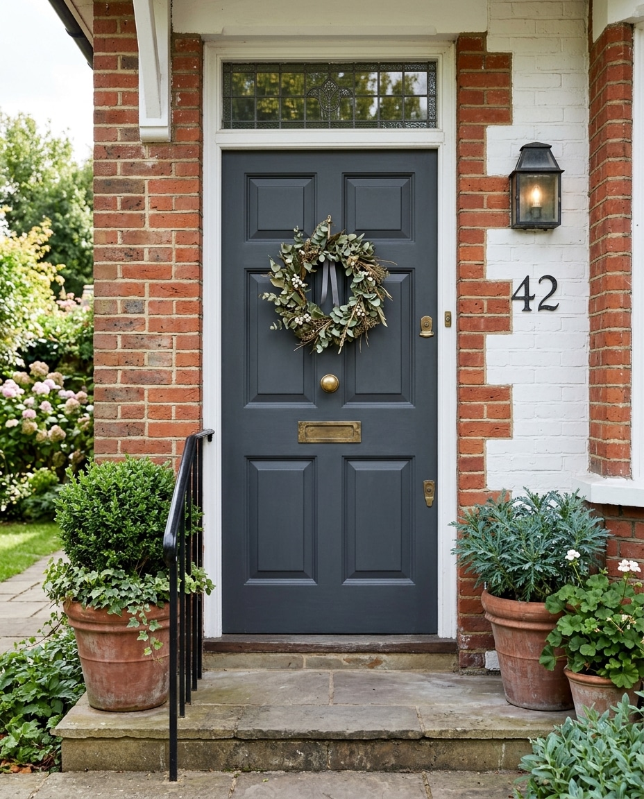
The precise sweet spot between safe and modern.
Updates older homes without changing their personality. Makes modern homes feel intentional. Quietly become one of the most-used front door colors of the last decade.
Practical bonus: charcoal hides everything. Pollen, dust, fingerprints, the occasional muddy paw print.
Oversized matte black house numbers and a single architectural sconce. The combination is almost unfairly easy to get right.
9. Dark Blue-Gray
What happens when navy and charcoal have a child.
Modern, moody, timeless in equal measure. Enough blue undertone to feel alive. Enough gray to feel grown-up.
Farrow & Ball Down Pipe is the iconic version. Sherwin Williams Cyberspace runs a close second. Matte black sconces are the closer.
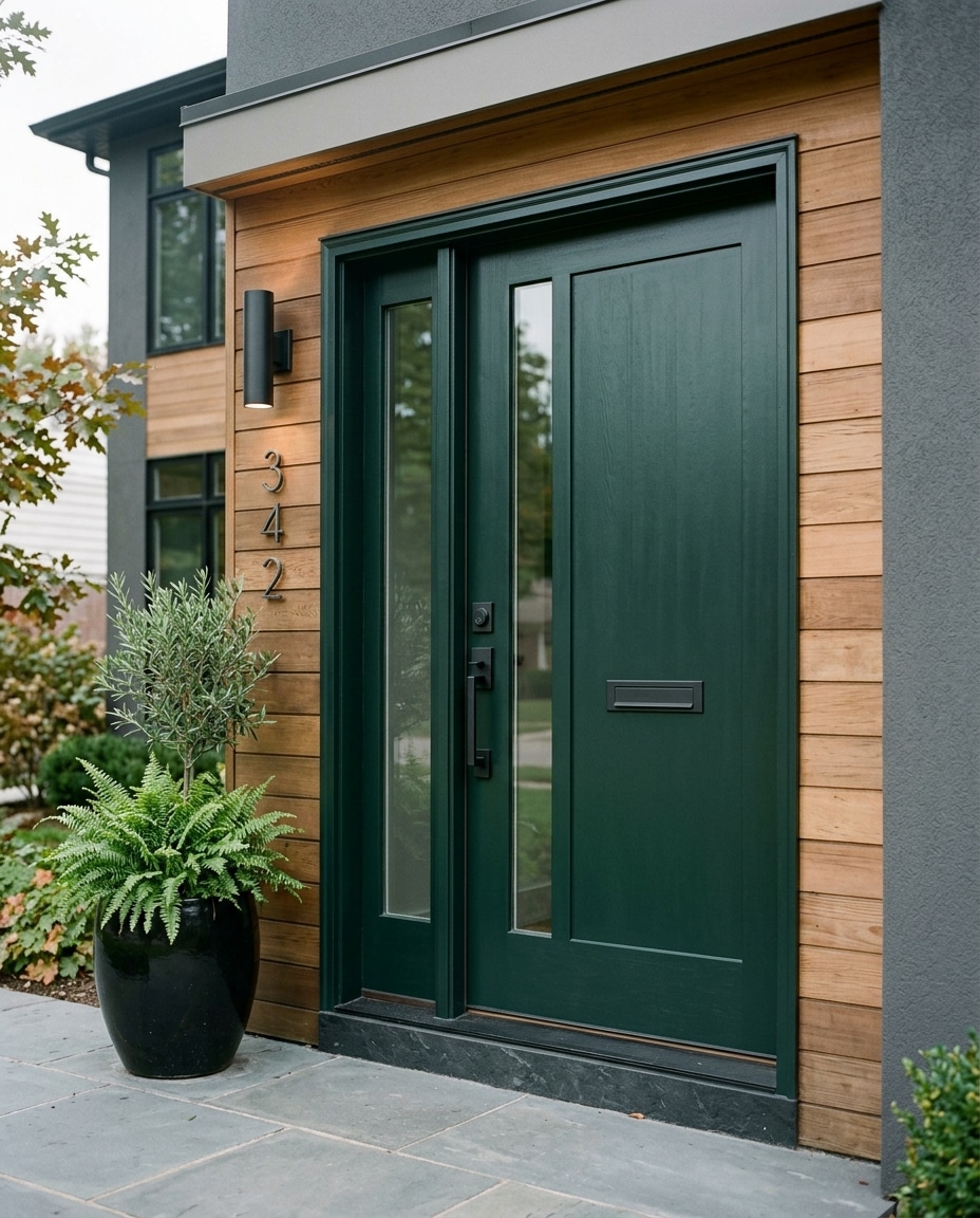
8. Forest Green
The deep, blue-leaning green that anchors a home into its surroundings without disappearing into them.
Changes more than almost any color on this list. Under shade it reads nearly black. In direct afternoon sun it reveals itself fully. At golden hour against cedar siding, it does something close to magic.
Cabins, craftsman homes, upscale traditionals. Copper lanterns and stacked stone are the dream.
7. Warm Walnut Wood
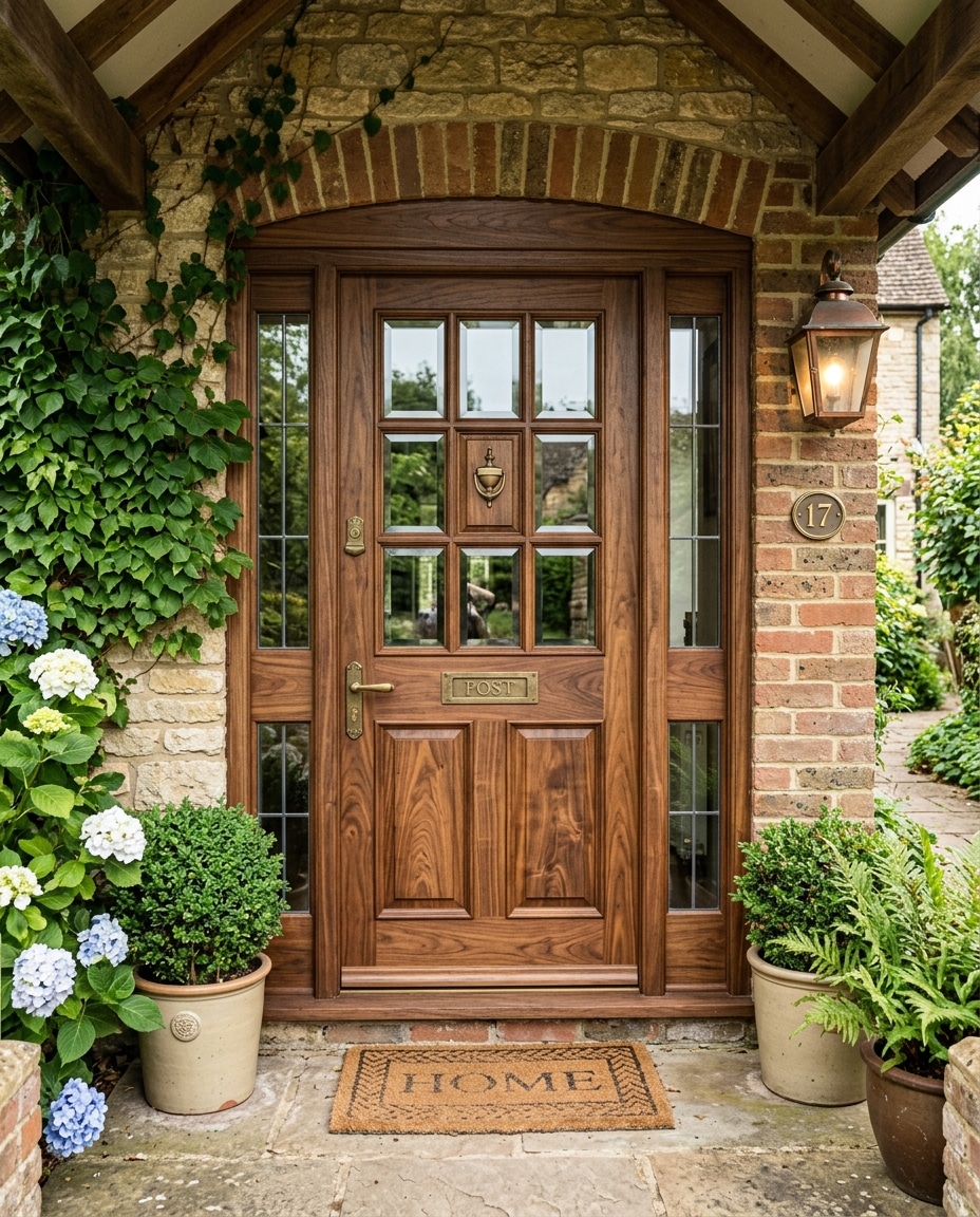
The only unpainted entry on this list. And one of the few that genuinely improves with age.
A walnut-stained door creates warmth painted doors fundamentally cannot replicate. The visible grain signals craft before anyone reaches the porch.
It’s the answer to homes that have gone too cold. Heavy gray stone, black window frames, charcoal cladding — all of it warms instantly when the door is wood.
Tradeoff is real. South-facing walnut needs re-oiling every couple of years. North-facing can go a decade.
6. Deep Burgundy
Burgundy telegraphs that a house has been cared about.
There’s a slightly historic quality to it. Even on a new build, a burgundy door makes the whole house feel a generation older than it is.
Brick colonials and cream-painted homes are the natural setting. In evening light especially, the depth becomes almost theatrical.
Matte finishes flatter it more than glossy.
5. Emerald Black-Green
A designer’s color.
Reads as black at first glance and reveals its green undertone only at certain hours and certain angles. The effect is intentional ambiguity — people can’t quite tell what color it is, and that’s the point.
Farrow & Ball’s Studio Green is the most famous example.
Best on cedar-sided modern homes and white contemporary farmhouses where the green has room to whisper. Oversized sconces help reveal it at night.
4. Classic Glossy Black
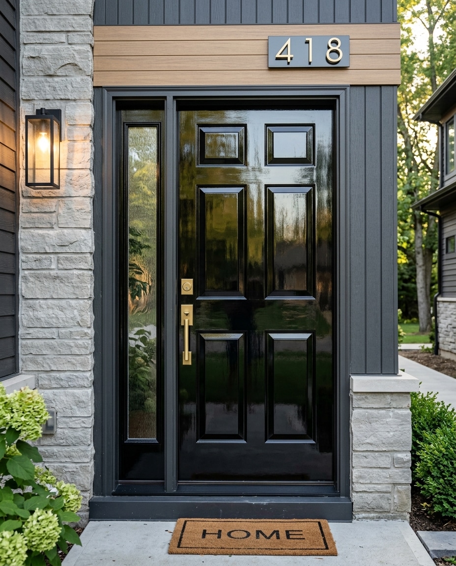
The most formal front door color in the canon.
The color of London townhouses, Georgian estates, old Boston brownstones. Nothing else conveys “dignified, symmetrical, serious about itself” as efficiently.
Farrow & Ball’s Pitch Black and Benjamin Moore’s Black Beauty are the heavyweights.
One real tradeoff: high gloss shows everything. Pollen, fingerprints, spiderwebs. Worth the wipe-downs only if you want the formality.
3. Matte Black
The modern version of glossy black. Softer, more architectural, far less precious.
Quietly became the default for a generation of designers who want their projects to look intentional without looking traditional.
Works on almost anything — white farmhouses, modern homes with black window frames, brick ranches that need an update, mid-century homes that need a sharper edge.
Benjamin Moore’s Wrought Iron and Sherwin Williams’ Tricorn Black are the two most-specified versions.
It’s the safest “bold” choice in residential design — which is to say, hardly bold at all anymore.
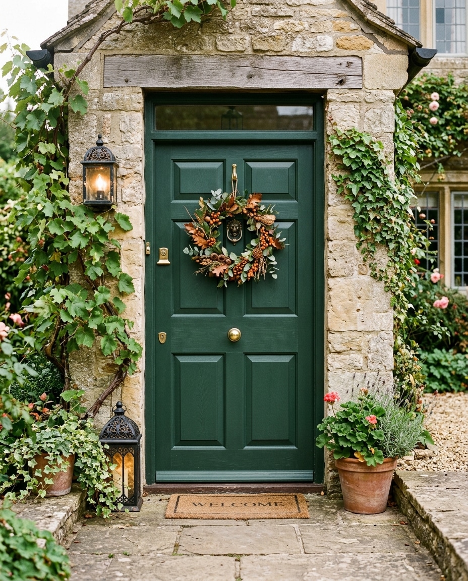
2. Timeless Deep Green
The deep, slightly muted, almost-black green that designers have been quietly painting front doors for two centuries.
Farrow & Ball’s Studio Green, Benjamin Moore’s Essex Green and Sherwood Forest — they all live in this family. They all do the same thing: make a house feel rich, considered, and slightly historic without leaning on any specific architectural style.
Works on a stunning range of homes. White farmhouses, brick suburban two-stories, cedar cottages, contemporary builds, Victorians.
What separates a timeless deep green from forest green or hunter green is the slight muddiness. There’s a touch of black or brown in the mix that keeps it from feeling like a costume.
Never quite vivid enough to date itself. Which is exactly why it ages for decades instead of seasons.
1. Navy Blue (Hale Navy)
If there is a single most-loved front door color in America right now, it is Benjamin Moore’s Hale Navy (HC-154).
Designers paint it. Real estate stylists recommend it. Homeowners pick it and can’t think of a reason to repaint it for fifteen years.
It is, by an unscientific but very real consensus, the most universally flattering exterior door color of the last two decades.
The reasons are practical. Navy is dark enough to feel polished and grounded — but blue enough to feel like a color rather than a default.
Works on white brick, pale gray siding, cream stucco, cedar shingles, painted clapboard, red brick. Pairs with brass, black, and aged bronze hardware. Photographs beautifully in nearly any light.
If your porch gets heavy shade, consider a slightly warmer alternate (Newburyport Blue is the standard). Ultra-cool navies can disappear in low light.
Otherwise, this is as close to a universally correct front door color as residential design produces.

I’m Chris and I run this website – a resource about symbolism, metaphors, idioms, and a whole lot more! Thanks for dropping by.